Oregon, United States
Member Since: April 05, 2008
entire network: 122 Posts
KitMaker Network: 23 Posts
Posted: Saturday, July 04, 2009 - 04:52 AM UTC
Dont know if this is the right place for this, so move it if needed.....
I am trying to rework a logo for my diorama products company, however I cant seem to think of anything good right now. I like my current one but its...well...plain. good for packaging and labels, but not for the site.
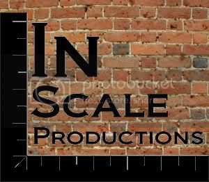
The company name is: In Scale Productions
This is what I have so far:

So if anyone can help me brainstorm so cooler/better looking logos that would be great!
I will give you credit if i use your image as my logo!
Chris Benshoof
In Scale Productions
"Quality Diorama Products"
Check out my website, subscribe to my news letter for discount codes, a new code each month! Saving you even more money on diorama products!
Rhone, France
Member Since: April 14, 2008
entire network: 383 Posts
KitMaker Network: 5 Posts
Posted: Saturday, July 04, 2009 - 05:17 AM UTC
Hi chris,
I 'll send you a PM.
Check your mail.
Regards.
Alexandre
Oregon, United States
Member Since: April 05, 2008
entire network: 122 Posts
KitMaker Network: 23 Posts
Posted: Saturday, July 04, 2009 - 07:11 AM UTC
well playing around a little and I got an idea....
Here is another option, better than the first I think....give me your feed back!

Chris Benshoof
In Scale Productions
"Quality Diorama Products"
Check out my website, subscribe to my news letter for discount codes, a new code each month! Saving you even more money on diorama products!
California, United States
Member Since: August 25, 2008
entire network: 369 Posts
KitMaker Network: 174 Posts
Posted: Saturday, July 04, 2009 - 07:34 AM UTC
The first one is better. The second is too symmetrical, and basically boring. The first tells 'what you do' by use of the scales. I'll take a shot on Mon. (7-6), when I get back to work. Start thinking of variations off the first; that's the right track.
Matt
On The Bench:
1/32 F-105D "Memphis Belle II"
Oregon, United States
Member Since: April 05, 2008
entire network: 122 Posts
KitMaker Network: 23 Posts
Posted: Saturday, July 04, 2009 - 07:42 AM UTC
Matt,
I agree, however I do like the look of the steel and screws.....and having color also helps it. But you are right it still needs something....and I do like the scale as well.....work brain work

Chris Benshoof
In Scale Productions
"Quality Diorama Products"
Check out my website, subscribe to my news letter for discount codes, a new code each month! Saving you even more money on diorama products!
England - North East, United Kingdom
Member Since: March 22, 2008
entire network: 1,042 Posts
KitMaker Network: 33 Posts
Posted: Saturday, July 04, 2009 - 08:06 AM UTC
" I find television very educating. Every time somebody turns on the set, I go into the other room and read a book. "
Groucho Marx (1890 - 1977)
Oregon, United States
Member Since: April 05, 2008
entire network: 122 Posts
KitMaker Network: 23 Posts
Posted: Saturday, July 04, 2009 - 08:11 AM UTC
markab,
That is pretty cool! So far I like that the most......maybe if I placed that on the metal surface...
Chris Benshoof
In Scale Productions
"Quality Diorama Products"
Check out my website, subscribe to my news letter for discount codes, a new code each month! Saving you even more money on diorama products!
Oregon, United States
Member Since: April 05, 2008
entire network: 122 Posts
KitMaker Network: 23 Posts
Posted: Saturday, July 04, 2009 - 08:31 AM UTC
Here it is with a twist......still think I like yours the best, simple but good!

Chris Benshoof
In Scale Productions
"Quality Diorama Products"
Check out my website, subscribe to my news letter for discount codes, a new code each month! Saving you even more money on diorama products!
Oregon, United States
Member Since: April 05, 2008
entire network: 122 Posts
KitMaker Network: 23 Posts
Posted: Saturday, July 04, 2009 - 08:48 AM UTC
Just to rattle the pot a bit, whichever design I go with I will make payment to you with a free kit once production starts, along with credit for the image on my site.
Chris Benshoof
In Scale Productions
"Quality Diorama Products"
Check out my website, subscribe to my news letter for discount codes, a new code each month! Saving you even more money on diorama products!
CMOT
 Editor-in-Chief
England - South West, United Kingdom
Member Since: May 14, 2006
entire network: 10,954 Posts
KitMaker Network: 1,873 Posts
Posted: Saturday, July 04, 2009 - 12:37 PM UTC
Western Australia, Australia
Member Since: June 05, 2007
entire network: 2,166 Posts
KitMaker Network: 473 Posts
Posted: Saturday, July 04, 2009 - 01:13 PM UTC
Great ideas, nice to see people helping out.
CMOT, I hate to criticise (because I certainly couldn't do any better), but your logo reminds me of
Accurate Armour . Not to say that's a bad thing, just not completely original.
Chas

Like Military History? Check out the History Club forum here on the Kitmaker Net.
Oregon, United States
Member Since: April 05, 2008
entire network: 122 Posts
KitMaker Network: 23 Posts
Posted: Saturday, July 04, 2009 - 01:28 PM UTC
Man this will be tough to decide! All are great ideas! CMOT nice idea about the A, and I like the "wood grain" on the scales!
Again I will leave this open for the month of july, whoever comes up with the design I use will get credit for it on my site as well as a free kit!

Chris Benshoof
In Scale Productions
"Quality Diorama Products"
Check out my website, subscribe to my news letter for discount codes, a new code each month! Saving you even more money on diorama products!
California, United States
Member Since: August 25, 2008
entire network: 369 Posts
KitMaker Network: 174 Posts
Posted: Saturday, July 04, 2009 - 02:26 PM UTC
That's the best so far. Try it with the cross beam of the compass centered vertically between the 'c' and the 'L'; try it with a smaller "In" just to see how the relationship works. Just a thought.
Matt
On The Bench:
1/32 F-105D "Memphis Belle II"
CMOT
Editor-in-Chief England - South West, United Kingdom
Member Since: May 14, 2006
entire network: 10,954 Posts
KitMaker Network: 1,873 Posts
Posted: Saturday, July 04, 2009 - 02:51 PM UTC
Chris it is copper not wood and can be changed to any color you wish, I felt it was important to retain the image you have been using until now. All you really need is something to attract the eye of a viewer when it is amongst a group of other manufacturers goods and something that is instantly recognizable without the need to physically read it when established. Chas you are correct however I had not even thought about what other manufacturers use, I was considering an implement that indicates accuracy and could be used centrally in the emblem.. Matt I will put some other samples up later as I retained the PDF file.
Oregon, United States
Member Since: April 05, 2008
entire network: 122 Posts
KitMaker Network: 23 Posts
Posted: Saturday, July 04, 2009 - 02:58 PM UTC
Oops my bad...I see it now.....I do like it!
Chris Benshoof
In Scale Productions
"Quality Diorama Products"
Check out my website, subscribe to my news letter for discount codes, a new code each month! Saving you even more money on diorama products!
CMOT
Editor-in-Chief England - South West, United Kingdom
Member Since: May 14, 2006
entire network: 10,954 Posts
KitMaker Network: 1,873 Posts
Posted: Saturday, July 04, 2009 - 03:44 PM UTC
California, United States
Member Since: August 25, 2008
entire network: 369 Posts
KitMaker Network: 174 Posts
Posted: Saturday, July 04, 2009 - 06:15 PM UTC
Darren:
Very nice work. Try this (just to see: 1 version) line up the "I" with the "s"; 2 version) move the "In" so that the angle in the 'N' is directly over the top of the compass. See what you think if the "IN" is maybe 2 pts. smaller. I think the red version in the lower right corner is great. Red, Black and white are hard to beat...basic and straightforward. Good go, Darren.
Matt


On The Bench:
1/32 F-105D "Memphis Belle II"
Oregon, United States
Member Since: April 05, 2008
entire network: 122 Posts
KitMaker Network: 23 Posts
Posted: Saturday, July 04, 2009 - 07:36 PM UTC
I agree, I really like the red one in the lower right! Nice work, you have put alot of effort into this!

Chris Benshoof
In Scale Productions
"Quality Diorama Products"
Check out my website, subscribe to my news letter for discount codes, a new code each month! Saving you even more money on diorama products!
CMOT
Editor-in-Chief England - South West, United Kingdom
Member Since: May 14, 2006
entire network: 10,954 Posts
KitMaker Network: 1,873 Posts
Posted: Saturday, July 04, 2009 - 07:54 PM UTC
Matt this is the last one. Take a crack at it yourself.

Chris as I kept the template it is not hard to change.
California, United States
Member Since: August 25, 2008
entire network: 369 Posts
KitMaker Network: 174 Posts
Posted: Saturday, July 04, 2009 - 08:11 PM UTC
Okay. I'll take a ride into the office tomorrow and take a shot. How do I send something like this? Do I save it as a .pdf and then post it in my photos or what? All I've ever done is photos. By the way, you've done some excellent work here. In no way do I want you to think I'm detracting from it. These are great ideations on a theme. Let me know how I can post some stuff here, and then maybe something will come out of it. You've don the majority of the development already. I really like the compass.
Thanks,
Matt
All I've ever used is the old drawing board, pen and ink style artwork.

On The Bench:
1/32 F-105D "Memphis Belle II"
CMOT
Editor-in-Chief England - South West, United Kingdom
Member Since: May 14, 2006
entire network: 10,954 Posts
KitMaker Network: 1,873 Posts
Posted: Sunday, July 05, 2009 - 04:17 AM UTC
Matt just create your elements and save them as a PDF file (Chris will most likely want the PDF so he can fine tune his requirements), then when you have assembled the elements the way you want and are happy with it flatten and save as a JPEG. I was not upset with anything you said I was just not altering the image any further tonight as I had had enough.
These were hard work due to the number of elements


Illinois, United States
Member Since: June 30, 2008
entire network: 1,199 Posts
KitMaker Network: 369 Posts
Posted: Sunday, July 05, 2009 - 06:08 AM UTC
Personally I like the original logo with a little add-on. I do not have the ability to actually play around with it and show an example but Im thinking maybe the rough outline of a ruin behind the actual name to jazz it up a little bit.
Evan
Removed by original poster on 07/05/09 - 17:31:02 (GMT).
California, United States
Member Since: August 25, 2008
entire network: 369 Posts
KitMaker Network: 174 Posts
Posted: Sunday, July 05, 2009 - 06:38 AM UTC
I' trying again. Here are two versions that I worked with. Thanks to Darren for the compass. It's a good point of departure. What I worked with was the typographical elements and their spatial relationships. So:
Version 1:

Version 2:

These are .jpgs. If you would like to use them, I will be glad to send them to you in any format you want. What do you think? Let me know. I enjoyed doing these. Good work, Darren.
Thanks,
Matt
On The Bench:
1/32 F-105D "Memphis Belle II"
Illinois, United States
Member Since: June 30, 2008
entire network: 1,199 Posts
KitMaker Network: 369 Posts
Posted: Sunday, July 05, 2009 - 07:54 AM UTC
Heres what I got
Not great but maybe another starting point
Evan